This is the complete visual system behind Bremo: the symbol, the wordmark, the pastel palette, the type, the icons and the components that make every Bremo property feel like one company. Use it to build anything on-brand.
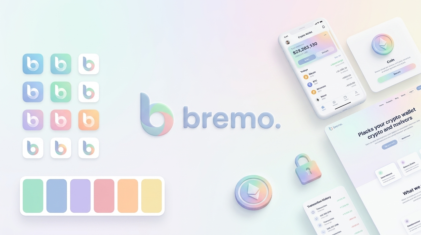
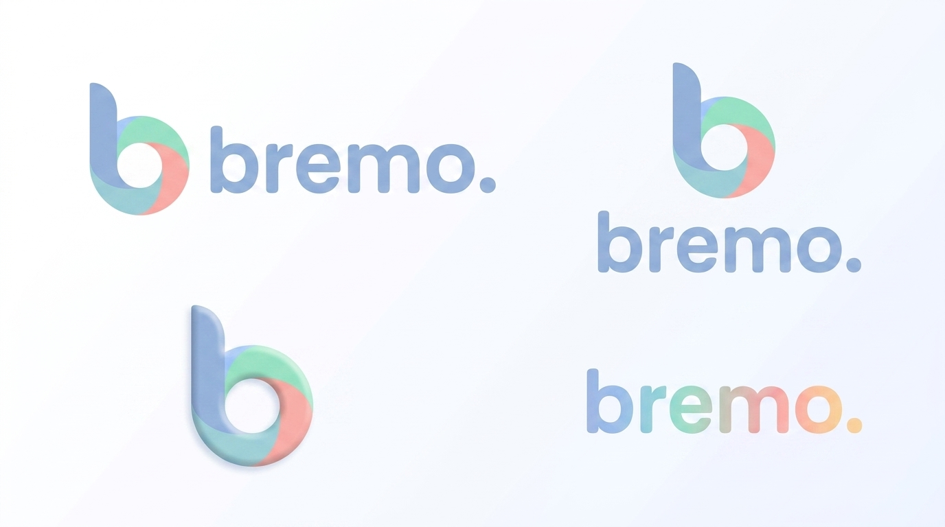
The Bremo logo is the b symbol paired with the lowercase bremo. wordmark. The trailing full stop is part of the mark: it signals calm, finished, done. This primary lockup is the default across every Bremo property.
Primary lockup, stacked lockup and gradient wordmark. The symbol always leads; the wordmark follows at the same optical height.
The wordmark is set in a rounded geometric sans. Keep the counter of the b open and the full stop tight to the o.
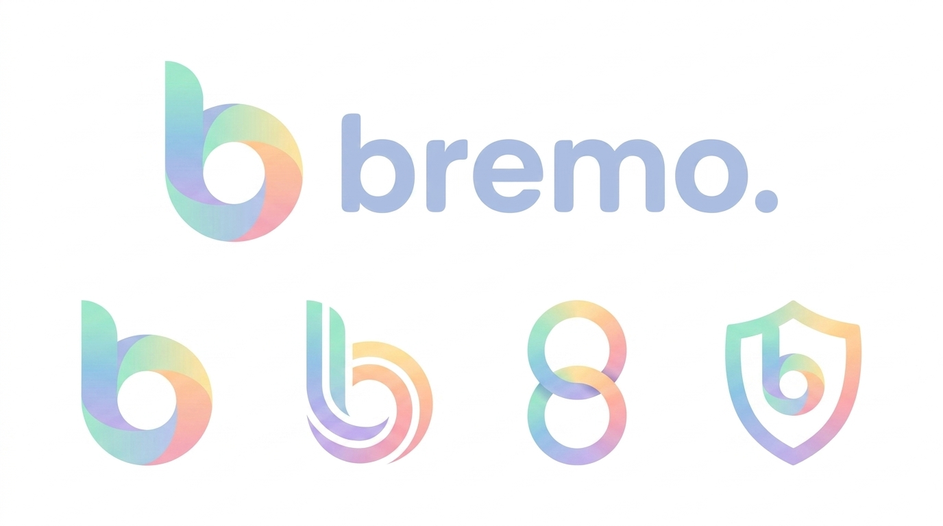
The symbol is a lowercase b whose bowl becomes a continuous loop, an endless ribbon. It reads as motion, flow and a coin at once. It carries the brand on its own wherever the full wordmark will not fit.

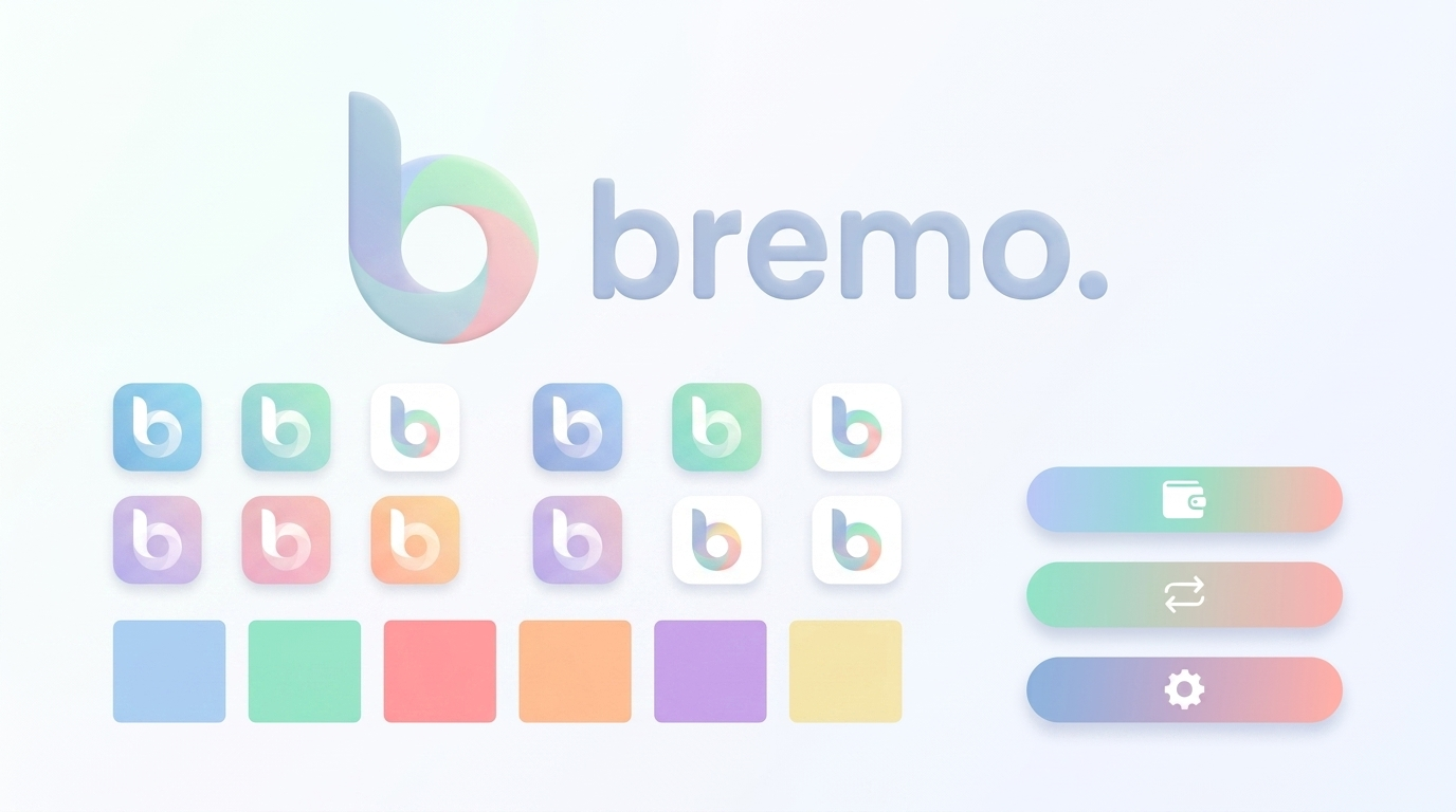
Sanctioned symbol variants: primary loop, layered depth, the infinity read, and the shield for security contexts.

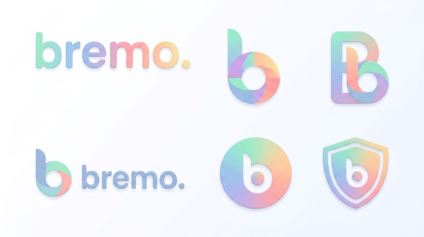
Monogram, circular coin badge and shield. Use the badge for avatars and the shield only where trust or security is the message.
Give the logo breathing room equal to the height of the b counter on all sides. Never place it inside a busy photo without a soft plate. Minimum sizes: symbol 24px, full lockup 96px wide on screen. Below that, use the symbol alone.
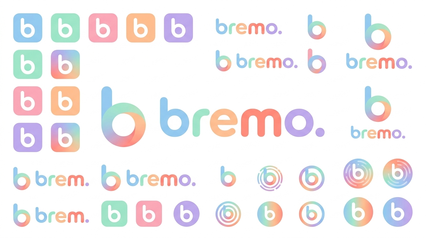
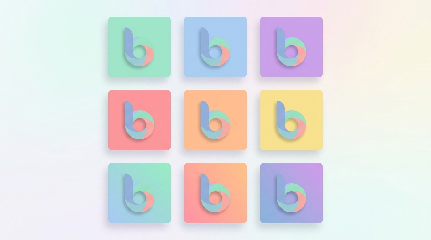
Every Bremo product ships a rounded-square app icon: the white b symbol on a single pastel field, or a pastel symbol on white. One colour per icon, never a gradient background behind the symbol.


Pick one palette colour per surface. Keep the symbol centered with even padding. The icon set is the fastest way a product signals it is part of Bremo.
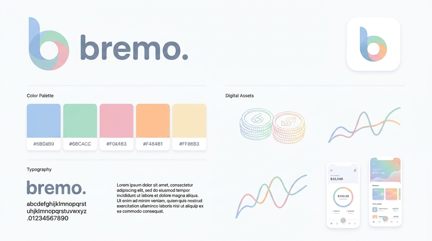
Six soft pastels, sampled directly from the brand boards. They are used flat for surfaces and blended left-to-right for the signature Bremo gradient. Keep text in the ink tones for contrast; pastels are for fields, accents and gradients, not body copy.
The Bremo gradient runs Sky to Mint to Peach to Lilac. Use it for the symbol, hero washes and accents. Ink text: #3F4256. Soft ink: #6B6F85.
Bremo speaks in a rounded, friendly, geometric voice. Headlines use a rounded geometric sans; body copy uses a clean humanist sans for long-form legibility.
Reference board: the wordmark and character set. Keep tracking tight on display sizes, open on body.

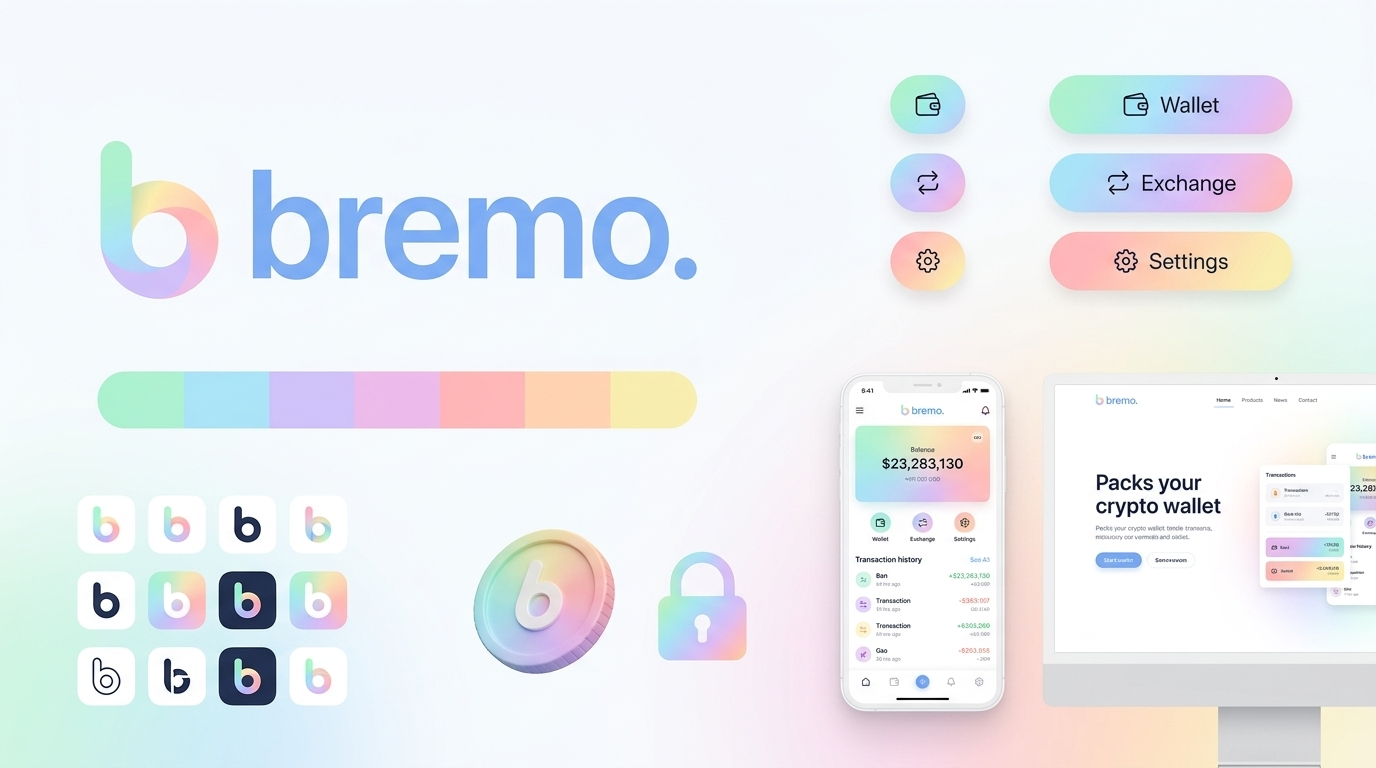
Interface elements are soft, rounded and gradient-lit. Pills and buttons use the palette as gentle gradients; line icons stay simple with rounded joints. Wallet, Exchange and Settings are the canonical product actions.

Component language: 999px pill radius, 18-22px card radius, soft shadows, gradient fills reserved for primary actions.
How the system comes together in a real product surface: balances, transactions, coins and charts, all sitting inside the soft Bremo world.

Product should feel weightless: generous whitespace, one accent gradient per screen, pastel surfaces, ink text.
The full brand board set. Right-click to save, or open for full resolution. These are the canonical Bremo brand references.